

Independent book designer layouts rely heavily on rigorous typographic foundations and structural planning to turn raw text into a cohesive, tactile object. Crafting a successful reading experience requires a deep understanding of structural geometry, visual pacing, and mechanical limits that govern print production. When creators approach a manuscript, they establish an internal logic that guides the reader’s eye effortlessly from the initial cover through to the final colophon. This careful architectural approach ensures that art and utility exist in perfect harmony across every single signature of the book.
What Is independent book designer layouts?
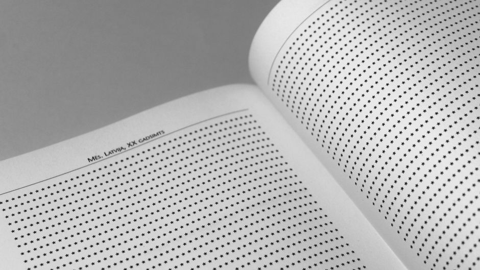
Independent book designer layouts refer to the specialized structural frameworks and grid systems created by independent professionals to organize typography, imagery, and whitespace within published volumes. These foundational frameworks dictate margins, grid alignments, type hierarchies, and page numbering to maintain absolute visual consistency. By establishing these structural rules early in the production cycle, designers can manage complex manuscripts efficiently while preserving high standards of aesthetic and functional craft.
The journey of shaping a publication begins long before any text is poured into columns or chapters are assigned numbers. Decisions regarding trim size—the physical dimensions of the finished book—dictate the proportional relationship between the printed page and the surrounding white space. Designers often consult historical proportions, such as the Golden Section or the canonical Canon of Page Proportions, to determine comfortable text blocks that feel balanced to the human hand. These early geometric choices directly influence how text curves into the gutter and how much thumb room is left at the bottom edge.
Once the page canvas is defined, the focus shifts to margins and the underlying grid. Establishing precise inner, outer, top, and bottom margins creates a harmonious container for the narrative, protecting the text from disappearing into the book’s binding. Within this container, a baseline grid acts as an invisible horizontal ruler that forces all lines of text across facing pages to align perfectly. This underlying discipline is crucial for multi-column layouts, image captions, and pull quotes, preventing the vertical wandering that causes visual fatigue during extended reading sessions.
Type hierarchy transforms raw letters into a clear, navigable landscape of meaning. Typographic systems demand careful consideration of scale, weight, tracking, and leading to distinguish between chapter openers, subheadings, and body copy. Often, professionals draw inspiration from broader fields of visual craft, occasionally examining how an independent typography studio builds custom glyph sets that lend a unique voice to literary and artistic editions. By selecting distinct type families for display text and running text, creators ensure that the typography serves the content without ever distracting from it.
The Changing Daily Routine
Designing books independently means balancing creative intuition with rigid technical constraints imposed by modern printing presses. Daily studio routines involve toggling between macro-level structural architecture and micro-level typographic detailing, such as adjusting letter-spacing in a troublesome headline or refining hyphenation zones. Crafting exceptional layouts requires an intimate familiarity with pre-press specifications, paper weights, grain directions, and binding methods like Smyth sewn or perfect binding. Every choice made on screen must account for how ink behaves on uncoated paper stock or how mechanical folding tolerances affect margins.
Paragraph styles and master pages streamline this intricate process, allowing designers to apply complex styling rules globally rather than manually altering every page. A robust style sheet governs everything from first-line indents and drop caps to space-above and space-below values for headings. Master pages handle recurring structural elements such as running headers, section titles, and folios, ensuring they remain anchored in the exact same coordinates throughout the publication. This underlying framework ensures that even as the content shifts dramatically from poetry to prose, the underlying geometric rhythm remains completely undisturbed.
Image treatment and figure placement require an entirely different set of technical considerations within the page layout system. Whether dealing with high-contrast monochrome photography or complex multi-color illustrations, designers must manage image resolution, color profiles, and bleed margins to guarantee faithful reproduction on press. Figures are often locked into specific grid coordinates to create rhythm and pacing, giving the reader visual breathing room between dense blocks of text. Captions are styled with distinct typographic hierarchies to differentiate them clearly from primary narrative paragraphs without cluttering the visual field.
Shifting Creative Spaces
Front matter and back matter demand precise structural sequencing to establish the book’s administrative and historical context. The opening pages—comprising half-titles, title pages, copyright information, dedication sections, and tables of contents—must follow established publishing conventions while reflecting the unique aesthetic of the edition. Managing pagination in these preliminary sections requires careful roman numeral numbering schemes that transition seamlessly into Arabic numerals when the primary chapters begin. Neglecting these small structural details can disrupt the professional cadence of the entire volume.
Running heads and folios serve as silent navigational waypoints for readers traversing extensive texts. By dynamically linking headers to paragraph styles, layout applications can automatically display the current chapter title or major section heading at the top of each spread. Folios—the page numbers—must be positioned with meticulous regard for the trim size and live area, ensuring they remain legible even after the bindery trims the printed signatures. These subtle navigational cues build subconscious trust between the reader and the book designer, guiding spatial awareness effortlessly.
“Typography is the invisible art that gives form to thought, transforming static letters into a living dialogue between author and reader.”
Ensuring absolute consistency across a publication without making every single page look identical requires mastering the art of controlled variation. Designers achieve this by establishing flexible layout modules that accommodate different content types—such as poetry, letters, or data tables—while adhering to the overarching grid. Furthermore, protecting intellectual property is essential when collaborating with photographers or illustrators, and many creators consult resources on UK copyright laws to secure proper licensing terms for every asset used within their page spreads. Balancing these administrative safeguards with wild creative exploration keeps the finished book both legally sound and visually captivating.
Balancing Practical Needs
The final phase of the layout workflow involves rigorous pre-flight checks and proofing to catch any orphan lines, rivers of whitespace, or trapped design errors before files are sent to the printer. Printing presses demand specific PDF export settings, including crop marks, color bars, and precise ink coverage limits to prevent muddy shadows or paper warping. Independent creators often work alongside local print artisans, discussing spine width calculations based on page count and paper caliper. For those engaging with broader creative communities, visiting spaces like a shared creative makerspace offers invaluable insights into traditional bookbinding techniques and physical craftsmanship that influence digital workflows.
Ultimately, the architecture of independent book designer layouts is an exercise in restraint, balance, and profound respect for the reading experience. By mastering trim sizes, baseline grids, typographic hierarchies, and pre-press technical limits, designers construct physical objects that honor the written word. Every measured margin and every carefully chosen font weight works in unison to build a silent, beautiful bridge between the author’s imagination and the reader’s hands.
References
- Bringhurst, R. 2004. The Elements of Typographic Style. Hartley & Marks.
- Tschichold, J. 1991. The Form of the Book: Essays on the Morality of Good Design. Hartley & Marks.