
Independent typography studio workflows form the meticulous backbone of modern graphic communication, transforming raw historical research into living, breathing digital alphabets. Every distinctive retail font or bespoke corporate typeface begins long before any software application opens its interface, starting instead within sketchbooks, archive libraries, and print workshops. Type design is a patient discipline where millimeter adjustments dictate whether a character feels clumsy or transcendent on a printed page. By observing how small design ateliers handle everything from initial cultural research to the final distribution paperwork, we gain a deeper appreciation for the written word. This comprehensive overview examines the painstaking technical milestones required to bring a professional typographic family safely out into the world.
What Is Independent Typography Studio Workflows?
Independent typography studio workflows encompass the structured yet deeply creative methodologies small type foundries use to research, design, test, and license retail or custom letterforms. These specialized pipelines bridge artistic exploration with rigorous engineering, ensuring that thousands of individual glyphs function harmoniously across diverse digital screens and print mediums. Rather than relying on automated tools, independent typographers carefully map out every structural decision to maintain aesthetic integrity and high operational legibility.
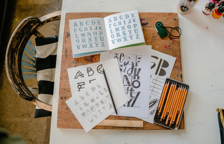
The journey of any new typeface typically originates in broad historical investigation, visual observation, and conceptual sketching. Designers often pore over centuries-old manuscripts, weathered street signage, or architectural engravings to extract unique structural DNA that can inform a contemporary release. These early explorations help establish the fundamental mood, contrast ratio, and historical footing of the project. During this exploratory phase, creators test basic stroke widths and transitional angles on paper before committing any permanent vectors to a digital screen. Such analogue origins anchor modern letterforms in human touch, preventing them from feeling overly clinical or sterile.
Once the basic mood and core skeleton are defined on paper, the workflow shifts toward digital vector construction and character expansion. Drawing individual letters requires an intimate understanding of optical sizing, stem weights, and terminal curves to ensure visual consistency across the entire alphabet. Creators must balance mathematical consistency with optical illusions, knowing that geometric precision does not always equate to visual harmony. This phase involves drafting the foundational lowercase and uppercase characters—often starting with the classic pairing of uppercase H, O, n, and o—to establish master proportions. As these core letterforms solidify, the character set expands rapidly to include numerals, punctuation marks, math symbols, and accented characters for international publishing standards.
The Changing Daily Routine
Transitioning from initial vector drawing to systemic spacing and kerning represents one of the most intense cognitive shifts within any studio calendar. Spacing involves assigning exact sidebearings to every glyph, dictating how white space flows natively between letters without manual intervention. Kerning then steps in to resolve specific optical collisions, such as the awkward gap that naturally occurs between an uppercase A and a V. This meticulous phase demands immense concentration, often supported by specialized resources like the independent digital agency setups guide for organizing complex digital files efficiently. Typographers view this stage as musical composition, where rhythm, pacing, and silence are just as vital as the notes themselves.
Following successful spacing trials, the digital font files must undergo comprehensive cross-platform testing to guarantee performance in real-world environments. At this stage, independent foundries generate preliminary desktop and web font formats to evaluate hinting, screen rendering, and binary stability across various operating systems. Designers test their creations at tiny body copy sizes as well as massive headline proportions, checking for unwanted visual artifacts or distortion on high-density displays. Real-world validation also involves printing out multi-page specimen sheets to examine ink spread, contrast weight, and reading fatigue on physical paper stocks. Ensuring robust functionality requires studying established standards published by organizations like the Association Typographique Internationale (ATypI) to verify technical compliance.
Type is a beautiful mechanism that turns silent shapes into spoken voice, reminding us that every curve carries the weight of human history.
Beyond technical validation, contemporary type foundries must also navigate the intricate landscape of intellectual property protection and commercial distribution rights. Ensuring that a completed font family remains secure against unauthorized sharing involves implementing clear End User License Agreements (EULAs) tailored for desktop, web, and electronic publication uses. Many creators look to resources such as independent designer copyright laws in the uk to understand how legal frameworks safeguard original digital assets. Establishing transparent licensing terms protects the considerable months of labor invested by the studio while giving clients clear usage boundaries.
Shifting Creative Spaces
The physical workspace of a type designer has evolved dramatically, blending quiet analog drafting tables with high-powered digital workstations optimized for curve manipulation. In many independent studios, collaborative spaces allow type designers to share feedback with visiting graphic artists, printmakers, and web developers. Such community environments often mirror shared manufacturing spaces, drawing inspiration from initiatives like building shared creative workshops where multidisciplinary creators pool their equipment and expertise. These dynamic environments foster organic critique, helping typographers spot minor optical flaws that might go unnoticed during solitary work sessions.
Physical specimen design remains the crowning celebration of a completed type project, merging editorial layout skill with typographic showcasing. A well-crafted type specimen is not merely a sales catalog; it is an immersive art object that demonstrates the voice and emotional range of the font family. Studios carefully select paper weights, ink finishes, and editorial copy to highlight the unique personality of their newly minted letterforms. These printed artifacts are then mailed to design agencies, universities, and typography enthusiasts worldwide, bridging digital commerce with tactile tradition. Through physical specimens, typography studios honor the enduring magic of print, closing a creative loop that started months prior with a simple pencil sketch.
Balancing Practical Needs
Bringing a typeface from concept to commercial viability requires strict adherence to project management and financial sustainability principles. Independent foundries cannot rely solely on creative inspiration; they must balance meticulous glyph expansion with realistic marketing schedules and promotional campaigns. Establishing efficient internal milestones helps prevent endless fine-tuning loops, ensuring that new font families reach the market while remaining relevant to contemporary design trends. This operational discipline enables small studios to sustain themselves financially without compromising the artistic integrity that defines their brand.
As the typography landscape continues to embrace variable fonts and multilingual character sets, studio workflows will undoubtedly adapt to meet rising technical demands. Designers now build complex multi-axis interpolation models that allow a single font file to shift seamlessly across weight, width, and optical size parameters. These advanced capabilities require a deep understanding of font engineering, coding scripts, and rigorous quality assurance protocols. By maintaining a steady rhythm of research, meticulous drawing, rigorous testing, and thoughtful release planning, independent typography studios will continue shaping the visual culture of tomorrow.
References:
Association Typographique Internationale (ATypI). 2023. Guidelines for Digital Type Design and Global Standardization. ATypI Technical Publications.
Bringhurst, Robert. 2004. The Elements of Typographic Style. Version 3.0. Hartley & Marks Publishers.